1998
After several previous initiatives to support culture, art and progress, all of Telefónica's social work is concentrated and brought together in our Telefónica Foundation. Meanwhile, the company embraces its new logo in which the brand's graphics appear in full.
The soul of Telefónica is born
01
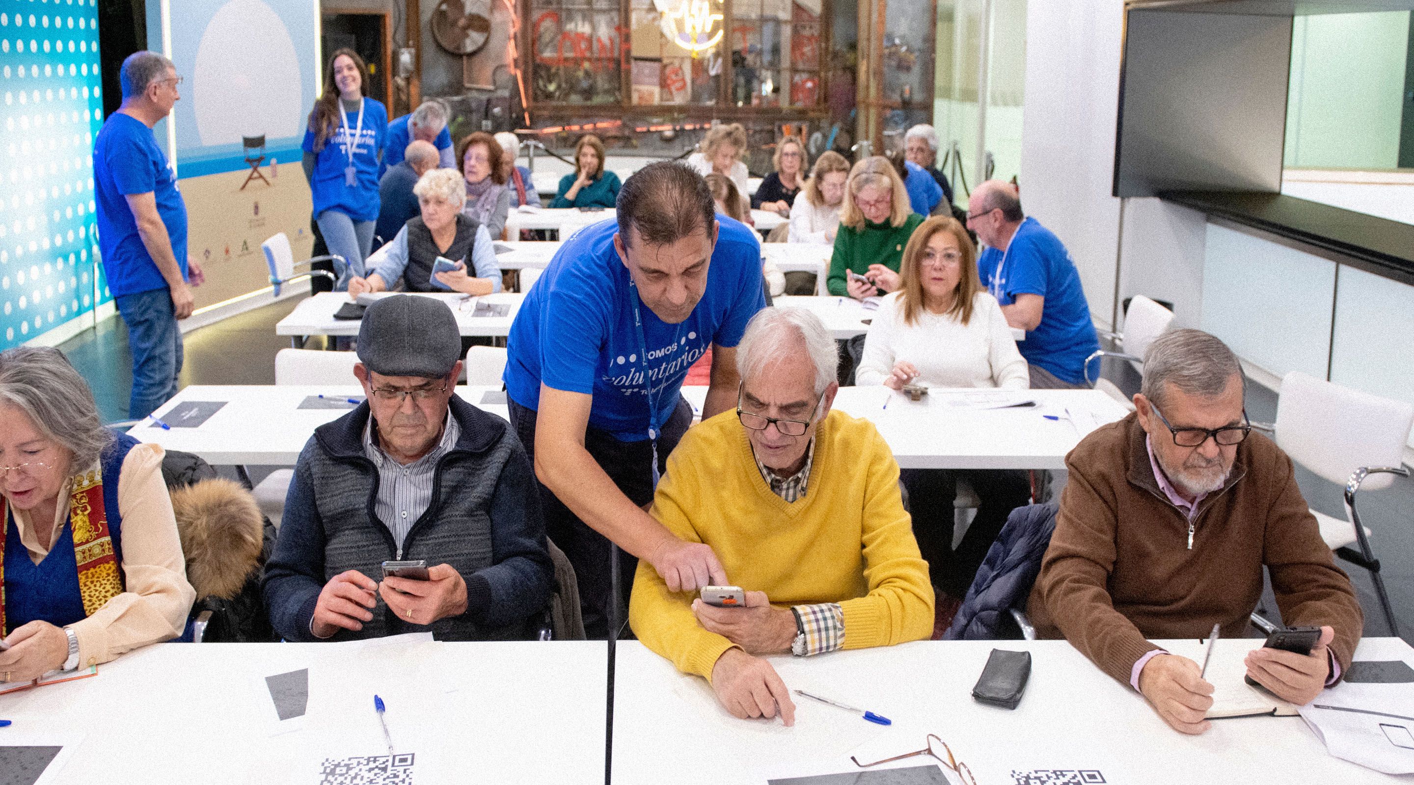
Telefónica had already launched social action initiatives such as ATAM and even a more discreet foundation called Fundesco. But it is not until 1998 that Fundación Telefónica is born in its full scope, with a global character and a vocation to improve society. Its incorporation is approved at the General Shareholders' Meeting of that year and it is created with an initial endowment of 300 million pesetas (1.8 million euros). Its statutes state its purpose: to promote activities of general interest, and in particular: to manage, promote, foster, disseminate, protect and defend the artistic, cultural and historical-technological heritage of Telefónica, S.A. and its own. It will also deal with the promotion and dissemination of science and technology and their impact on society, culture, contemporary art and new technologies in any of their expressions. Over time, Fundación Telefónica has focused its efforts on training, guiding and advising responsibly in digital skills so that all people can develop their potential and face the challenges of the present and the future, promoting inclusive digitalization. Through initiatives that help reduce the educational gap (ProFuturo project), boost employability (R4E, Conecta empleo, 42), promote knowledge (Fundación Telefónica Spaces, Telos magazine, publications, etc.) and promote solidarity and digital inclusion (Corporate Volunteering-Reconectados).
Historical increase in capital
02
In April 1998, Telefónica announces a capital increase, which concludes one month later as the most important operation of this type in the history of the European stock exchanges. It consisted of the issue of 85,406,438 new Telefónica shares, worth 427,032 million pesetas (some 2,600 million euros) in new funds.
New logo, with full name
03
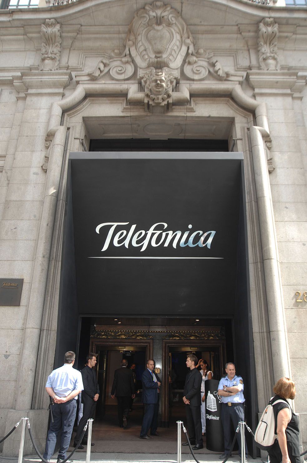
It is one of the most remarkable and boldest changes in the history of our logo. The company was growing in customers, markets, shareholders, portfolio. It was one of the most important companies in Spain and one of the most important telcos in the world. Juan Villalonga, the chairman in 1998, believes that the company should have its name in full in the logo. To be read and written in the same way in all markets and to display the corporate colours, dark blue and green. It thus abandons the traditional "T" with dots to adopt an elegant logo in which the word "Telefónica" could be read. It was also intended as a bid to bring itself up to date for the new century. In 2010 these shades would change, but not the text.
The Clear Plans
04
Telefónica is learning fast to compete in an open market where new players are already vying for customer favour. And when there is competition, the first thing to do is to publicise one's own offer in order to seduce a previously assured user. Telefónica's first major tariff campaign after market liberalisation was called Los Planes Claros (The Clear Plans) and has become iconic. With a simple message and clear tones, Telefónica tried to explain to the customer the different call options and prices for metropolitan, provincial, interprovincial and international traffic. Of course, in pesetas. Also in this year, 1998, residential customer service was consolidated into a single, free number, which we have kept to this day: 1004.
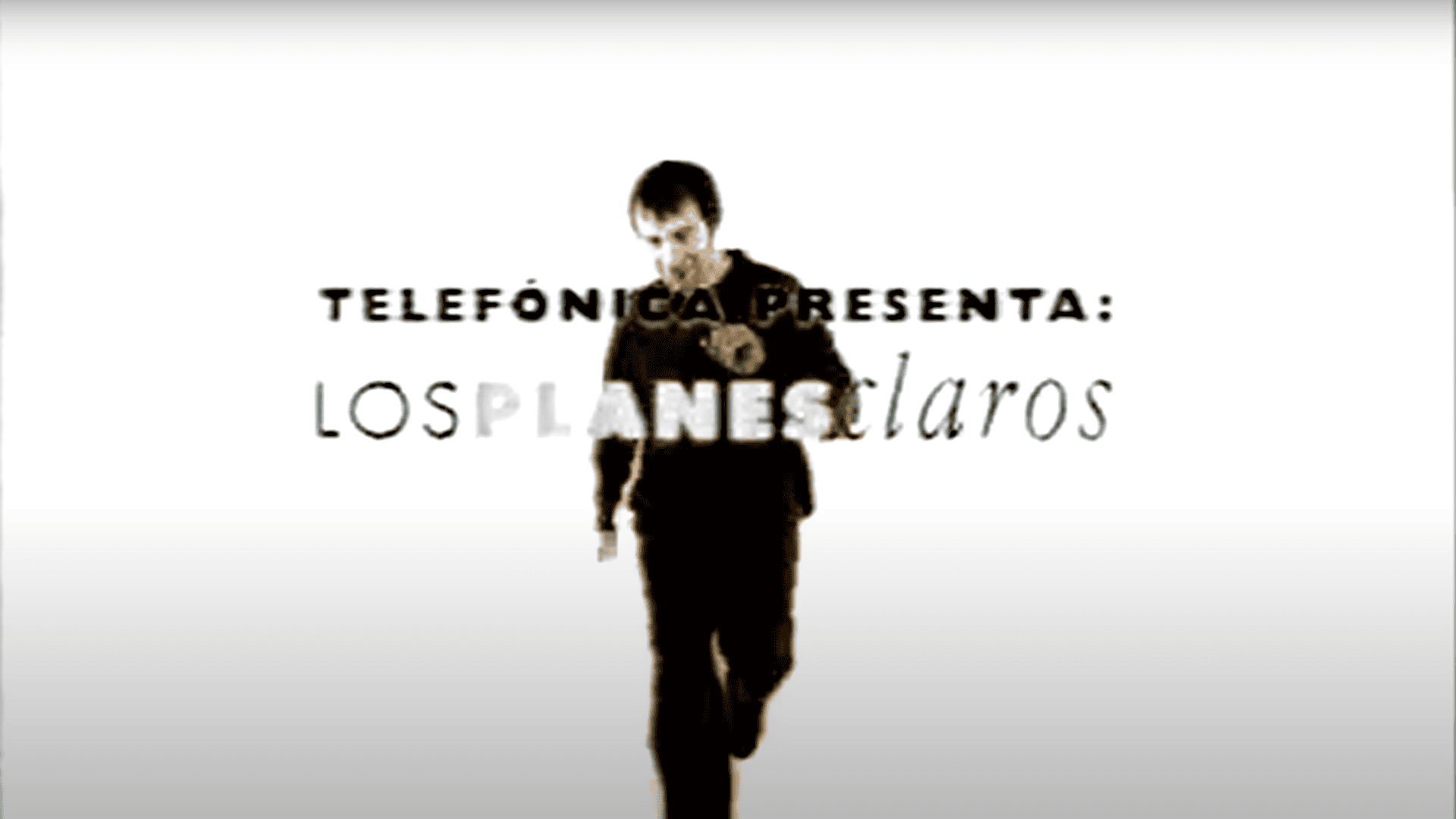
The Clear Plans
You must accept all cookies to see this content
Do you have doubts about what happened?
Ask Aura